
User Interface Design
When I was a kid I always wanted to be a creative type. I loved writing, I loved drawing, I loved music. I decided I was going to be a musician (and I was pretty good, a very long time ago). But if I was to have to get a "proper" job, then designer was what I wanted.
Neither of those happened[1][2] and instead, when I needed to actually work for a living, I got offered a job writing software. I liked computers and I was pretty good at it, so that's where I ended up.
I never let go of wanting to be a designer though. I just never had the time to learn the skills.
And, now, it's possible to produce decent designs without having to know those skills. Because, you know, they were stolen from every designer's web page and all those text books.
For example, I had put together a dashboard for Site Manager - it was OK, but not amazing. The app itself had a UI design that I kind of cobbled together myself. It was OK, but a bit bland.
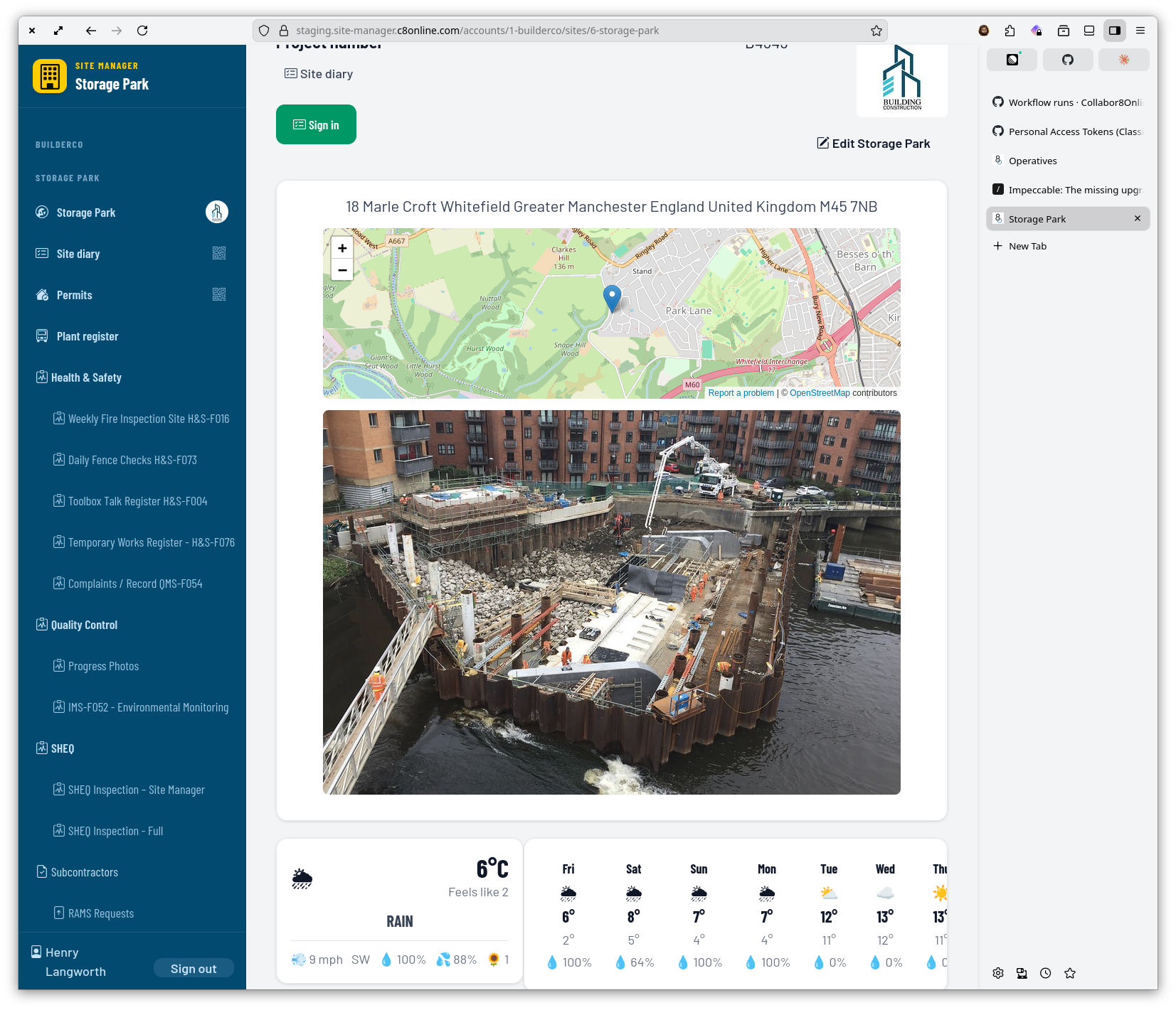
So I asked Claude to "come up with a design system for a web and mobile application aimed at construction workers on-site - remembering that many of them do not want to be using any time of computer or device at all". It did an exceptional job - a colour scheme that fits well with the general construction vibe, large touch targets making it extremely clear what to do at each stage and a nice choice of fonts (typography is still the single best thing you can learn about to improve your designs).
This last week has been me doing a load of work with Claude Code to implement this - with some pages having me write the code by hand (the first time in about four weeks where I've got my hands dirty). The results have been stunning so far.
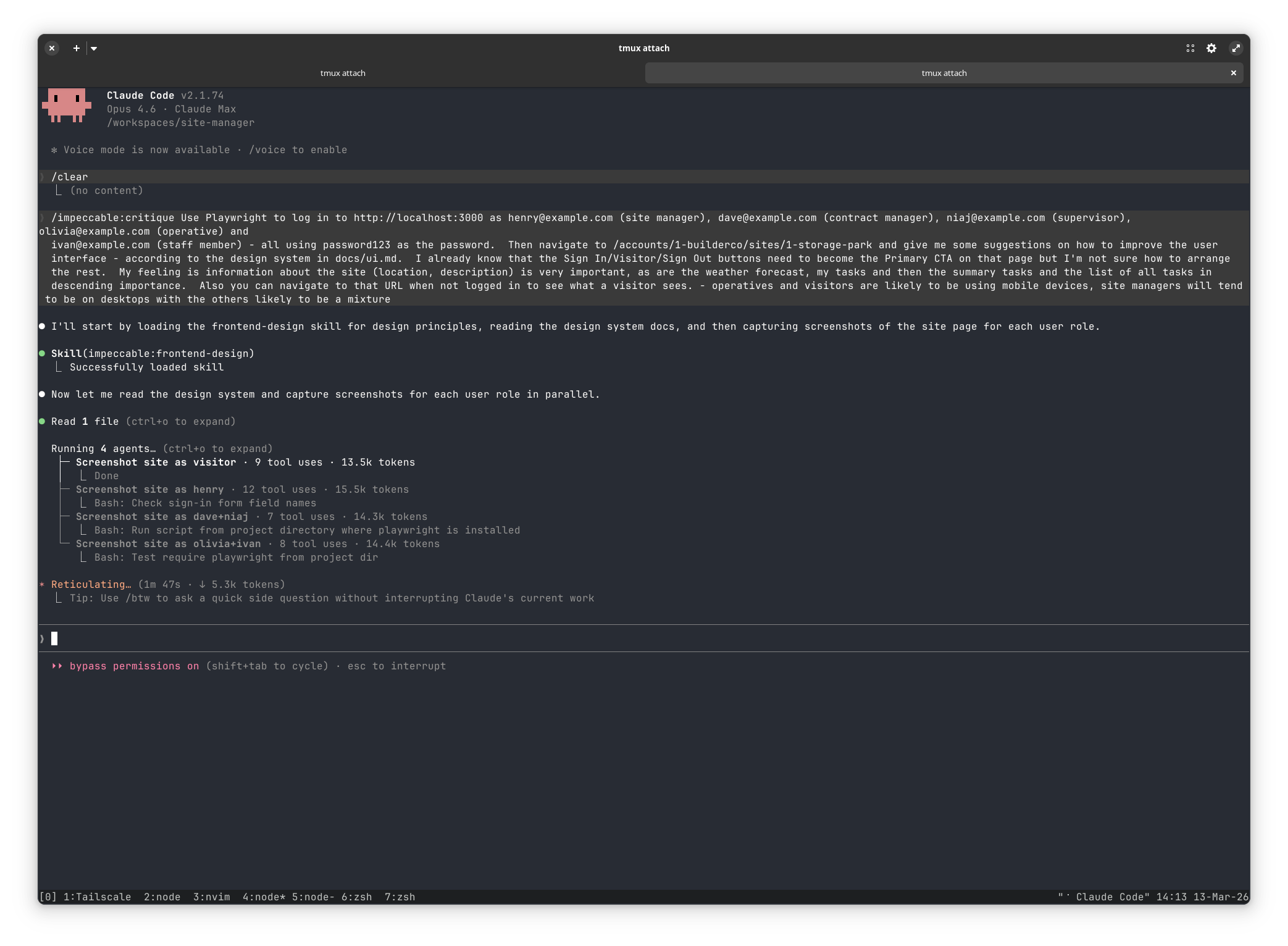
There are still a few pages to go through - but I've left the most important - the site dashboard - till Friday afternoon. I loaded up the Superpowers and Impeccable Claude plugins and then started the Rails server on my development machine. Within the devcontainer[3] I told Claude Code to "Use Playwright to connect to http://localhost:3000/accounts/1/sites/1 - firstly without logging in, then logging in as Henry (site manager), Ivan (staff member), Dave (contract manager), Olivia (operative) and Niaj (supervisor) - each is NAME@example.com with password123 - and take a screenshot at both desktop and mobile size. Then come up with a new layout for this page that fits with our new design system at docs/ui.md - I already know that the sign in/out button needs to match the Primary Call to Action button pattern. Finally, once implemented, use Playwright to regenerate these screenshots so I can review them".
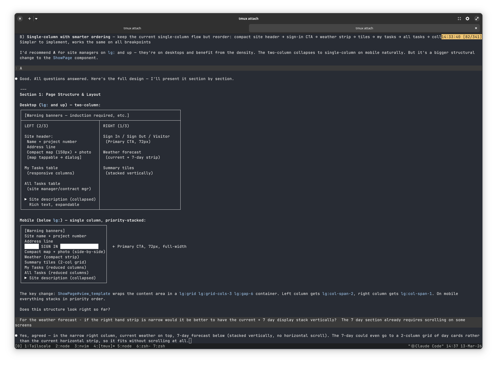
The LLM did its thing for about ten minutes, then came back with a critique of the current layout. It went on to ask me a load of questions - which bits of the layout are most important to which role, when is the mobile view more important than the desktop view and so on. I answered and it then generated a specification - asking more questions as it went. Finally, it generated a development plan, I cleared the context and told it to get going.
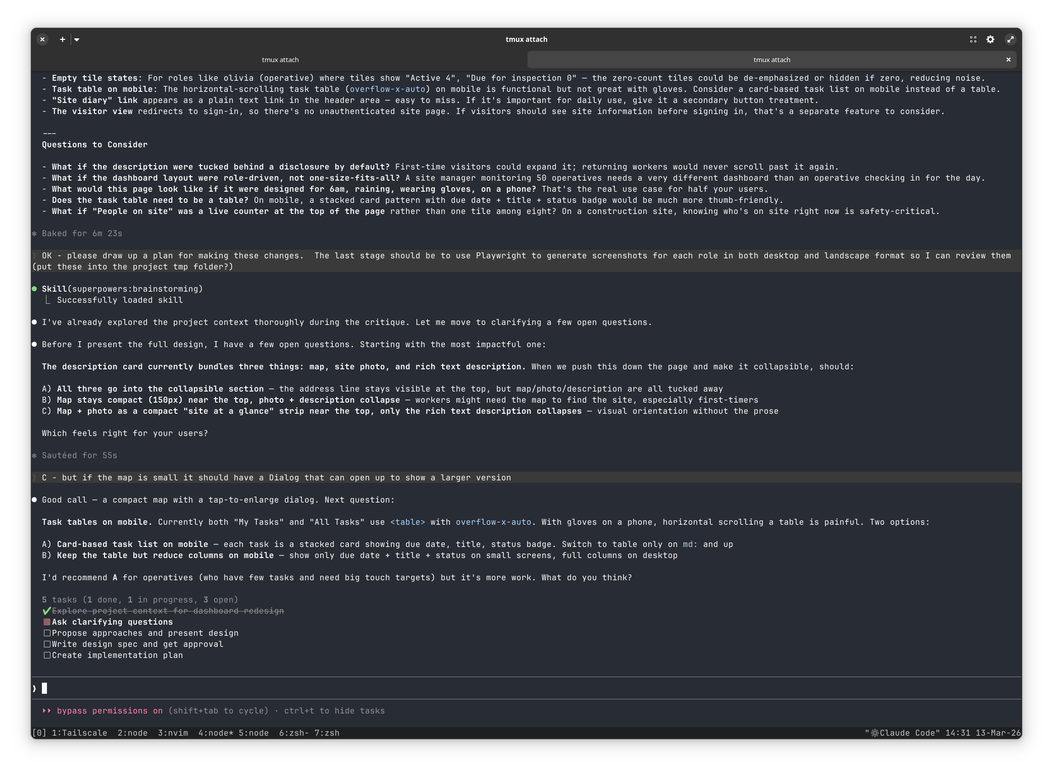
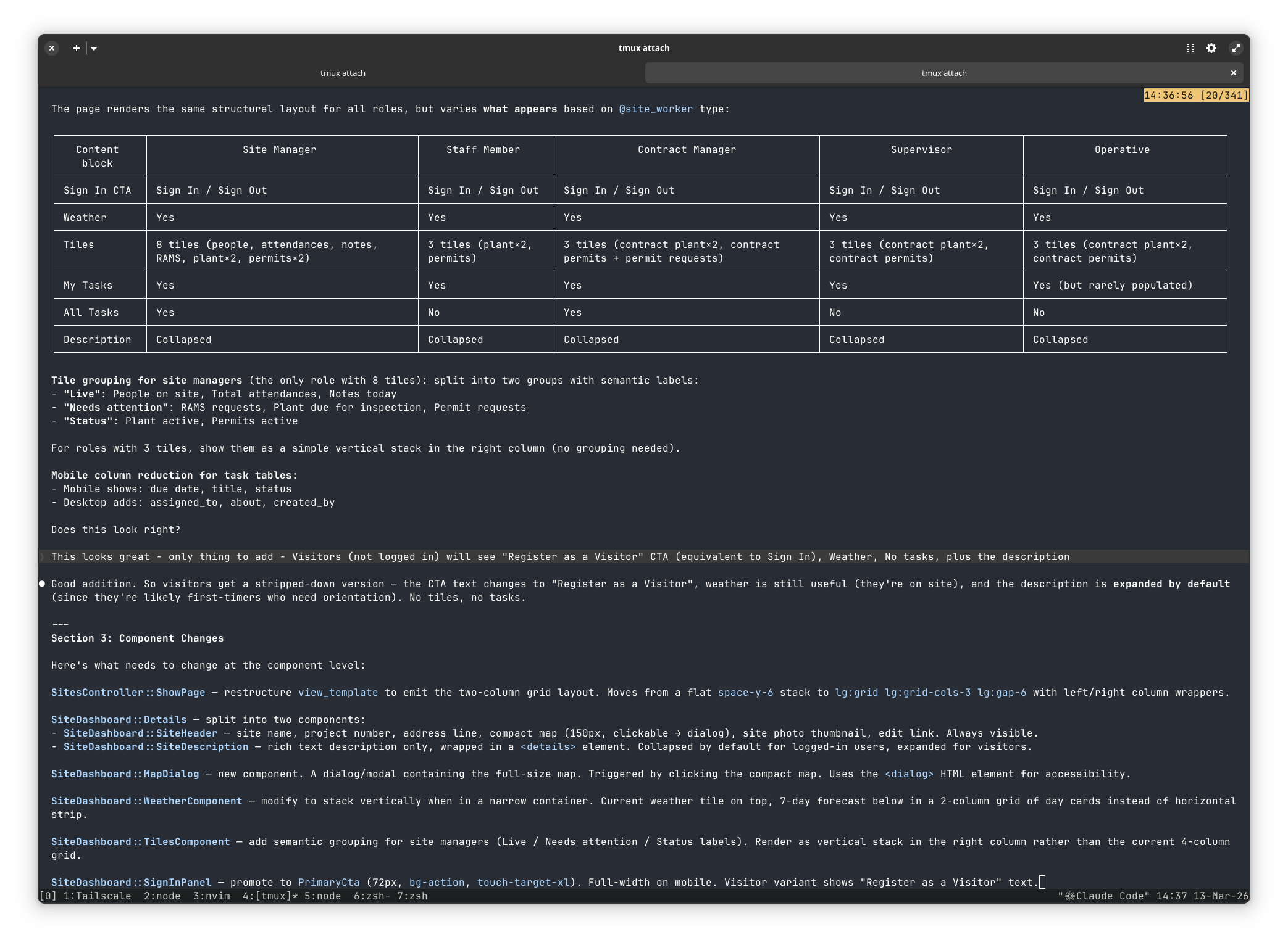
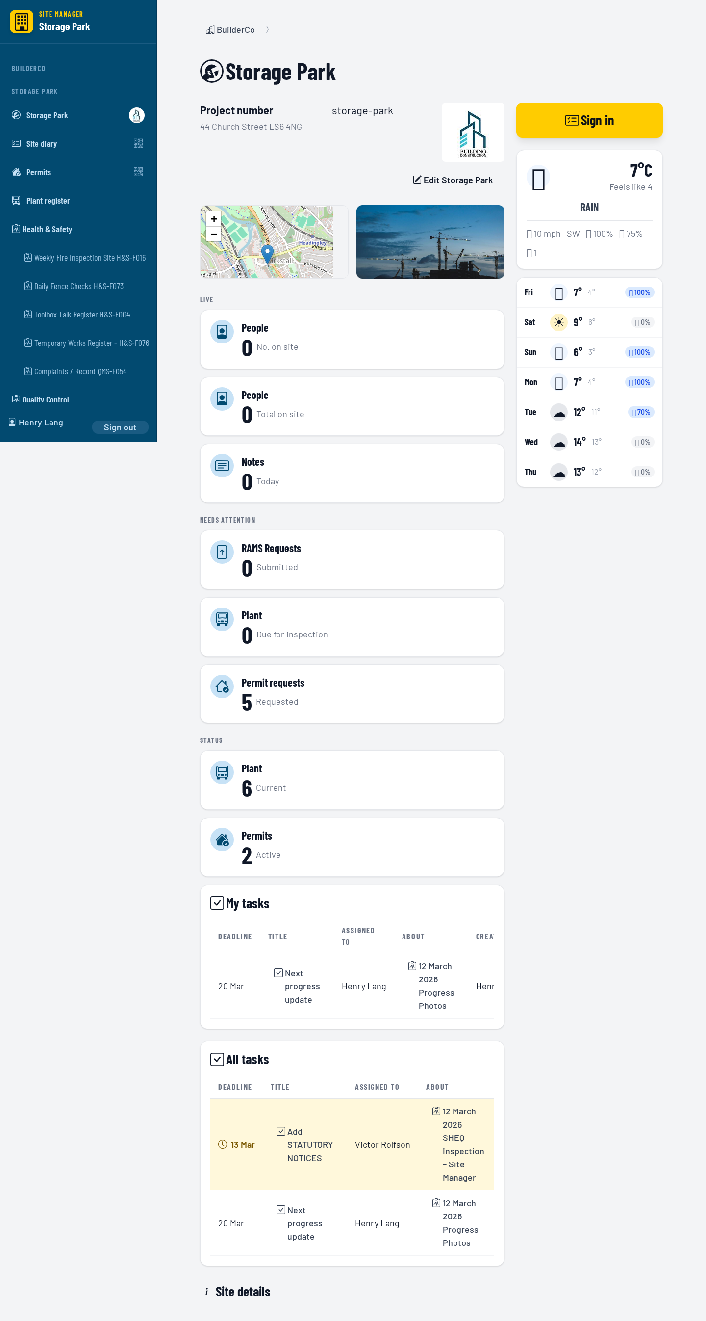
All of this took about 90 minutes in total. And when it was done I looked through the screenshots it had generated. They were good but had some obvious errors (the weather forecast was too squashed and unreadable, the two column version was unbalanced with one column much longer than the other and it had failed to figure out how to access the dashboard using the visitor role). So I gave it feedback: "the weather forecast is too squashed so needs to be in a single column, the two main columns are unbalanced so we can probably move the tiles to the other column to give them a similar height and here's how you access the page as a visitor - make these changes and then generate the screenshots again".
This second pass took about twenty minutes to complete and worked significantly better. However, I still had feedback: "Much better. Two things still to change - no need for the site icon between the map and photo - we can just leave that as blank space if needed. And the weather tiles are better with the
extra space but the contents are still squashed up too much. Please look at the screenshots and see how we can redesign the contents to make them work better with greater clarity and visual excitement". That last bit is important - I was telling it to look at the screenshots it had produced and analyse them itself (using the Impeccable Style skills) and come up with a better design for them.
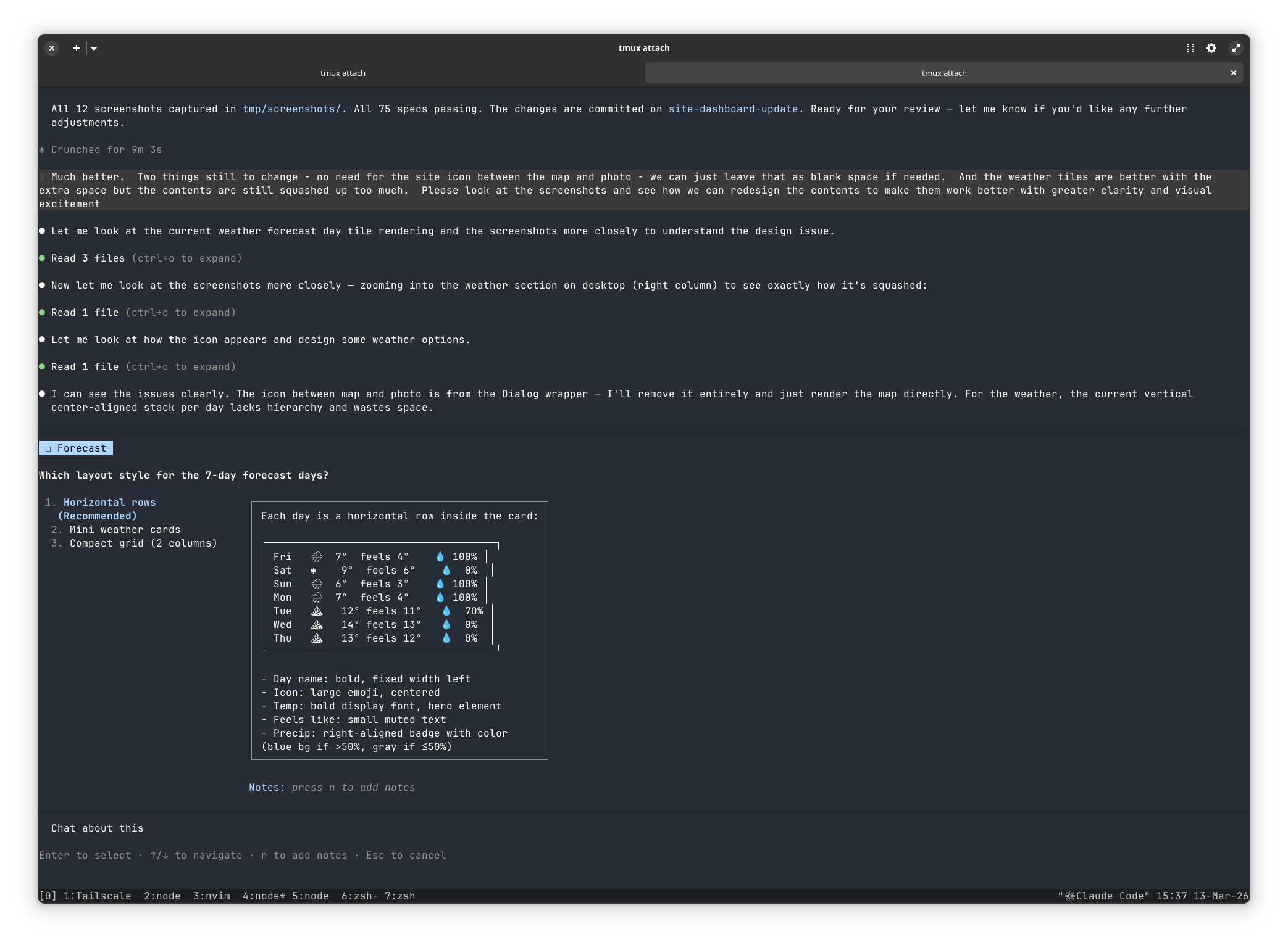
It offered me some options and I picked one. Five minutes later another set of screenshots - "can we have some colour on the weather forecast cards please - yellow for sun, blue for rain etc". Another visual inspection of the screenshots and I posted them to Slack for the others to look at.
Finally I did a quick git diff to see which files it had changed, making sure there was nothing unexpected - and ran the feature specs (which are Gherkin specifications that use Playwright to run the system end to end for the vast majority of the functionality). I did not really look at the code it had written - I knew it had not updated the specs, so I could be confident I would catch anything it had broken. And I did find it had missed a minor link off the new design - one that a lot of the feature specs relied on. So I added that in manually, getting the specs to pass. This is the key to making it work - this project already had really good test coverage (and the places where it did not, I got Claude to add in extra), so I knew I could trust the code that the LLM did write.
And the end result is a site dashboard that looks significantly better than it did before - at the cost of a couple of hours[4].
I didn't get to be a musician because I gave up after our drummer left to join the Spice Girls. That story is 80% true! ↩︎
I didn't get to be a designer because ... well I don't want to talk about it, it still makes me angry 35 years later and I really should let it go. ↩︎
Safety-first! ↩︎
I don't know how much it cost in tokens as I'm now on the Claude $100/month plan - this is enough for me to use it every working day for around 6 hours. By which time I'm tired out (I still have to think, even if I'm not writing code) so that's just about right. ↩︎